
Responsive Websites VS Mobile Friendly Websites
September 4, 2018
First things first – responsive DOES NOT equal mobile-friendly.
Many people believe the two are interchangeable and I am here to tell you they are absolutely not.
I mean, would you accept Chewbacca as Bigfoot or vice versa?
The two may appear similar, but in fact they are not. Seriously, could you imagine Bigfoot with a light saber? SCARY!
YourDictonary.com defines a mobile-friendly website as: “a website that is easy to use on a mobile device, especially the small screens of smartphones.”
Wikipedia defines responsive web design as: “an approach to web design that makes web pages render well on a variety of devices and windows or screen sizes.”
See the difference?
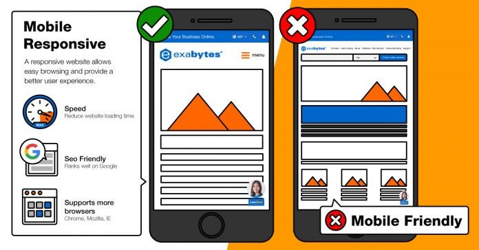
Just because a site is mobile-friendly does not mean it will perform well on a mobile device where a responsive website is specifically built and optimized for these viewing conditions. Your site may be functional as mobile-friendly, but it may not work to the best of its ability based on the device–example, touch screens.
The strength and benefits of a responsive design are almost limitless.
Like that time Luke fought the storm troopers… yeah, that was awesome wasn’t it?
I digress.
Responsive web design decreases the loading time of your website, helps your site to perform well on google and other search engines, and it will support more browsers making your site more accessible by various audiences.
At the end of the day, or light year, responsive sites provide a better user experience and allow your site to stay in front of the people you want, no matter where or how they are viewing it.
For more information on how Quadsimia can make your site responsive, just fill our Thrive page to schedule a free consultation.

Posted By:
Comments