Responsive Web Design and Development
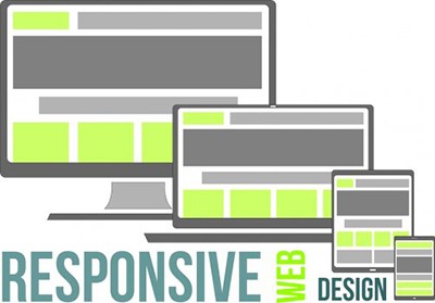
Responsive Web Design allows your website to fluidly expand and contract to the display screen on each device, ensuring that your website's visual appearance and functionality meets the resolution of each screen, as well as, adapts to the orientation (vertical vs. horizontal) of the users preference.
Responsive Design and Development adapts your website to a broad range of user devices, including smartphones, tablets, and PCs/Macs. With more people using these types of devices, it is important that your website meets the capabilities of these devices.
- Varying resolutions (width and height of visible screen space)
- Browser rendering (how different browsers display information)
- Navigational options (how different devices display menus and navigation)
- Quadsimia's approach of choice
- Create a winning user experience across all devices
- Ensuring your website delivers an optimal user experience
- Adapting your website to a broad range of user devices, including smartphones, tablets, PCs/Macs
- Allows your website to fluidly expand and contract to the display screen of all devices
- Ensuring your website's visual appearance and functionality meets the users resolution
- Adapting to the vertical or horizontal orientation of a user's preference
In the past few years, the growth of mobile Internet usage has increased, outpacing traditional forms of accessing web content. Today more people are reaching for their mobile devices or tablets to help stay connected and achieve tasks on the go.
In 2013, e-commerce accounted for approximately $638 billion but by 2018, that dollar amount will represent ALL mobile-specific commerce, with a concentration on tablets. Forecast per Goldman Sachs
FAQ
What is responsive design and development?
Responsive Design and Development adapts your website to a broad range of user devices, including smartphones, tablets, and PCs/Macs.
What Can Quadsimia Do For You
- Inform you of the most common devices accessing your website
- Determine what resolutions are most commonly using your website
- Build a website that allows the most common browsers (Internet Explorer, Firefox and Chrome) to display your information correctly
- Build menus and navigation that respond on a desktop, tablet or mobile device
Our Portfolio