
Is Your Business Ready For "Mobilegeddon"?
June 4, 2015
It's time to take mobile seriously.
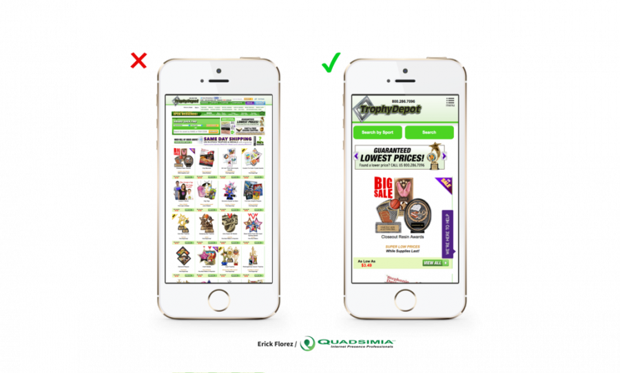
This is one of the biggest changes in years and Google has been warning websites of Mobilegeddon for some time now. Nearly 50% of search traffic happens on a smartphone yet, according to a portent.com study, 40% of the top sites on the Internet failed the mobile friendly test. The biggest factor in failed tests was font size and link spacing, meaning the links viewed on a mobile device were too close together causing users to unintentionally click to the wrong destination.
Additional factors to consider for passing the mobile friendly test are:
- Quick load time
- Easy navigation
- Large, easy to read text
- Avoid unnecessary tapping and zooming
- Mobile friendly plugins
What does this mean for your business?
It isn't doomsday for your business! You don't need to panic if your website is not mobile friendly, at least not yet, but you need to prepare. The change in how your website is served up in search results should be enough of a reason to get your site mobile friendly but not the only reason. Sure, sites that pass the mobile friendly test will receive a "boost" in Google searches but you also want to deliver the best user experience possible. Failure to adapt to change in industry trends could result in lost business.
Why now?
The way we search the Internet has changed. It's really that simple. Desktop devices are no longer dominating web searches. Although this change will NOT impact searches from a desktop or tablet, more and more consumers are relying on their smart phone for instant information.
What can I do?
The first thing you should do is visit your website on a mobile device. Then use the mobile friendly tester that Google has provided. The next step is to understand the difference between a responsive site and a mobile site. We here at Quadsimia recommend a responsive design instead of a mobile version of your website for a few reasons:
- You can build a website once and run it across all platforms.
- Website updates can be made once, on one central system, and reflect on all platforms.
- From a mobile device to a 27" monitor, responsive design fits any screen.
- It helps search engine optimization (SEO) because you don't want two versions of your site being indexed. This could be likely to happen if you have yoursite.com and m.yoursite.com (mobile).
How we can help?
We keep a pulse on industry trends and standards to better suit our clients. To better understand "Mobilegeddon" Quadsimia's own Kandi Humpf was a guest on WKTV Newstalk to discuss the changes.
Additionally, if you have any questions or concerns about preparing your business for the mobile friendly age, please feel free to reach out to us at any time. We are always willing to provide consultation on your existing website and offer solutions and services that can help you avoid "Mobilegeddon".

Posted By:
Comments